This animated storyboard has been created as an alternative and more accesible way to explore the content of the video ‘What are systematic reviews?’. This video can be downloaded here.
Each section contains a relevant animation to help explain each part of the script.
Introduction
‘Systematic reviews’ help make sense of many kinds of data. They are a way of reviewing all the data and results from research about a particular question in a standardised, systematic way. A systematic review helps give an objective and transparent overview of all evidence surrounding a particular question. |  |
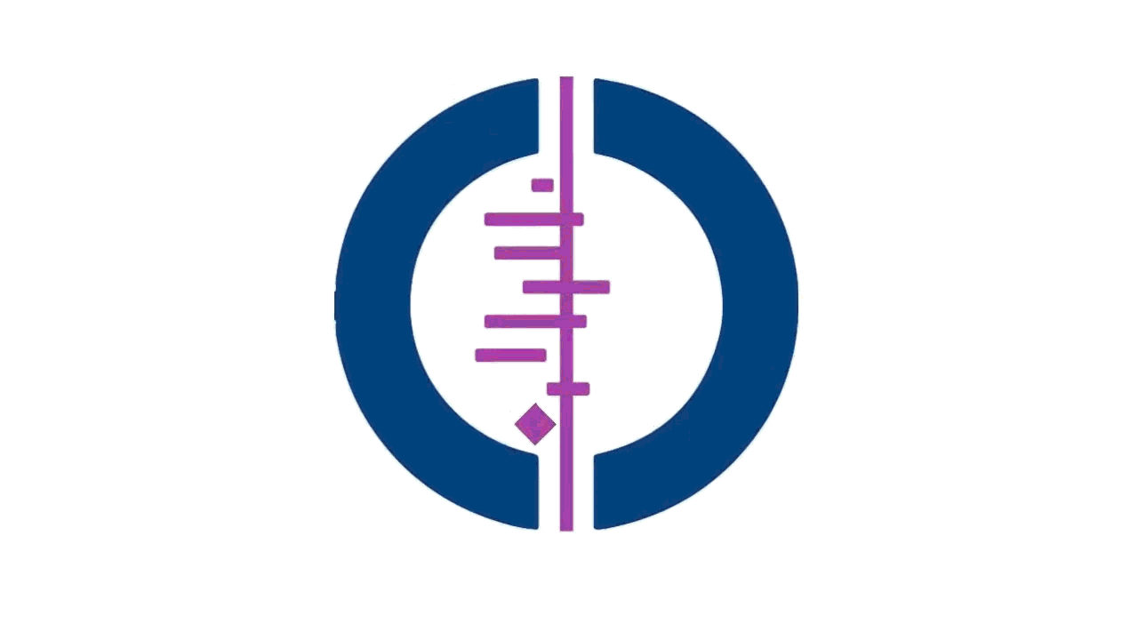
The Cochrane Collaboration logo visually represents how results from some systematic reviews can be explained. |
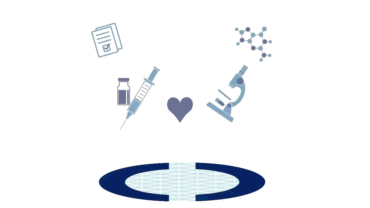
Here is how a systematic review works.First, a question must be defined, and an objective method for asking the question is agreed. Imagine a circle as the area defined by a question. Everything inside it concerns the question, everything outside of it, does not. In this circle, relevant data will be included. |
|
| A search for relevant data begins. This data can come from many sources, including data from clinical trials. |
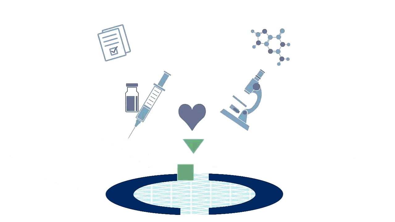
Imagine the shapes represent data sets from different research, for example, different clinical trials. |
|
| The data set must be the right shape to 'fit'. Only data from research that matches certain criteria can be included so that the results are reliable. For example, selecting research that is good quality and answers the defined question. |
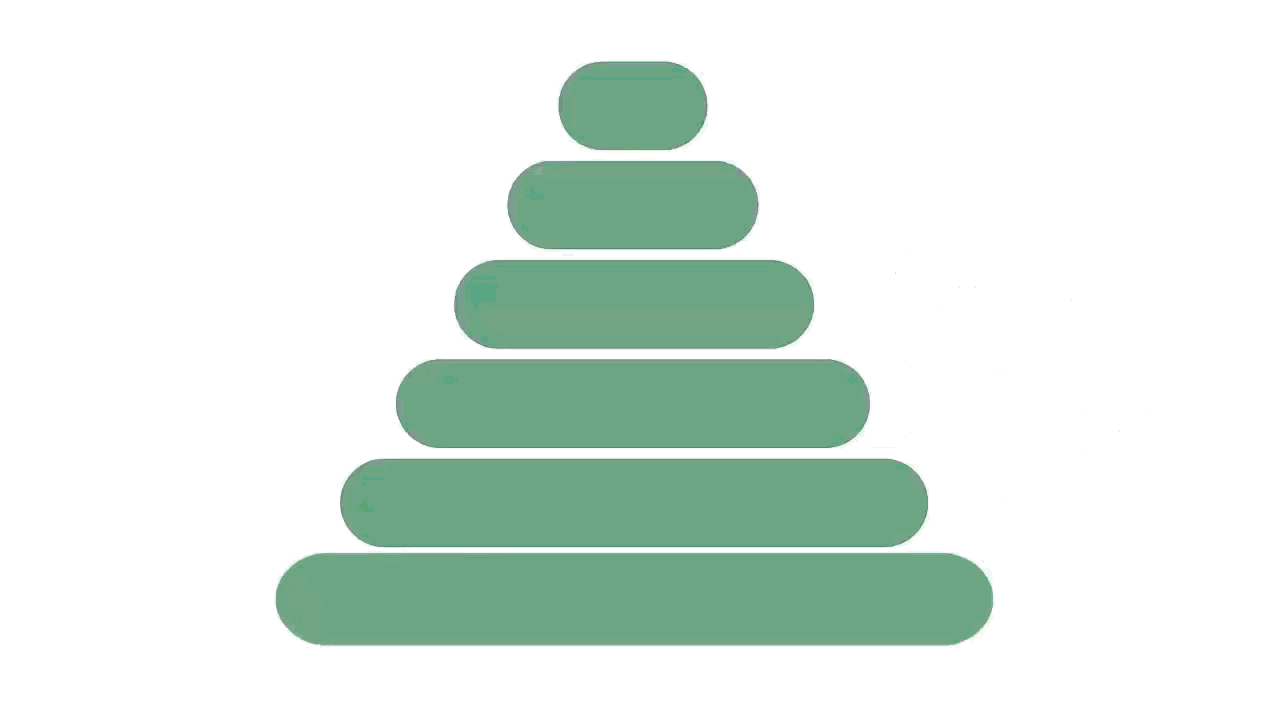
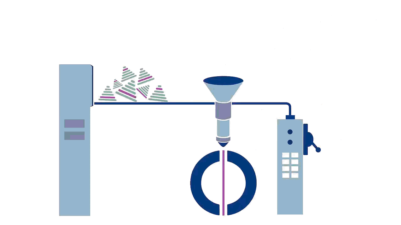
ExtractionIf the research meets the criteria, more detailed information about the research can be collected or 'extracted'. Information extracted can include:
| |
| This information is judged against criteria in order to assess the quality of the research. |
Analysis and combinationOnce the information is extracted the outcomes from all relevant research can be analysed and compared. Finally, once the data is analysed and compared, it can be combined (using complex statistical methods) to give an overall result from all of the data. This circle is one way of representing this data visually. It is called a blobbogram (or, a forest plot) |
|
| The area of inquiry, defined by the question, can be divided into a 'yes' and a 'no' half. A positive and a negative side. |
Imagine knowledge as light, and ignorance as darkness. The more 'spread' the focus of the light, the weaker it is and the less clear things are. If the light is focused and data is grouped more clearly, we can be more confident of what we see. The shorter the line, the more confident we are of what the data is telling us. Think of a longer line as less focused and scattered data, and shorter as more focused and bunched. |
|
| The diamond represents the combined results of all the data included. Because this combined results uses data from more sources than just one data set, it’s considered more reliable and better evidence The more data there is, the more confident we can be |


Acknowledgments
This animated storyboard was prepared by the Cochrane Consumers and Communication Group, La Trobe University and generously support by Cochrane Australia. Written by Jack Nunn and Sophie Hill. Graphics produced by Shakira Moss at Doodler.
These resources are free for anyone to use and adapt and are licensed under Creative Commons Attribution-NonCommercial 4.0 International (CC BY-NC 4.0)